Windows Phone 7 [The Competitors]
I know that writing about Microsoft in anything approaching a respectful tone is basically verboten on an Apple blog, but when Windows Phone 7 was announced, I was legitimately impressed. It's obvious there are some very smart people at the company—the Xbox 360 is successful for a reason. And I actually found myself wishing the Zune HD had Mac support when I first got my hands on one. But there were two MSFT divisions I was confident would never rise above mediocrity: Windows and Windows Mobile. You see, Microsoft is terrified of breaking compatibility in new versions of its operating systems and alienating its core base of enterprise users. But since mobile devices are widely regarded as the next great frontier in computing, and Windows Mobile 6.5 couldn't be seen as anything other than an abysmal failure, they decided to make a radical change.
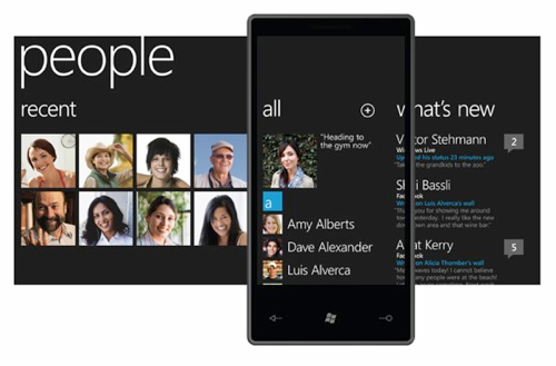
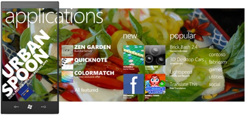
And I would argue that some of Windows Phone 7's design concepts are more radical than the iPhone's when it was first launched. Apple's idea of the home screen as a sheet of square icons representing single applications dates back to the Mac OS 9 Launcher. Microsoft, however, has icons on its home screen which launch "hubs" representing different activities: the "People" hub combines your recent calls, contact list and your friends' social network activity into one screen. When WP7 was announced at Mobile World Congress in February, the presenter kept repeating that "the phone is not a PC" as justification for their design choices (almost as if they kept needing to be reminded of it themselves!), and that philosophy is reflected in the Hubs: a phone's real estate and general context isn't necessarily suited for using one single-purpose app at a time. Hubs present a plethora of information geared towards the specific context in which you are currently using your phone: the People hub gives you general information on your contacts, the Games hub presents your Xbox Live information in addition to your games library, and the dedicated Search button on your phone provides contacts and local search in addition to Web search with Bing.
One thing I also like about the WP7 design is how interface elements are larger than the screen itself. Much has been made of how the iPad provides a form factor large enough to display both interface elements and content, whereas the iPhone can only display either a menu or an app's content at once because its screen is so small. I wonder if Microsoft's found a compromise in making the virtual dimensions of the application longer than the screen itself - providing room for both UI and content if one just takes the time to scroll horizontally. It reminds me a little bit of Scott McCloud's "infinite canvas" idea.
Looking at both on a computer screen, at least, I think WP7's interface makes iPhone OS look visually dated - although I'm sure it'll be a different story entirely when we see WP7 on an actual phone by the end of the year. (The two-icons-per-line design of the Windows Phone homescreen isn't something I'm very excited about.) But I'm worried about how sustainable the Hubs are. Microsoft's done a fine job grouping its own applications into a series of contexts in which the user might require specific information, but what about when users actually get a hold of these phones and start installing third-party apps? Will hubs become impossible-to-navigate messes, with thirty genres of games laid out on a single horizontal area? Still, I think this is one of the better efforts I've seen from a major tech company in recent months.
 del.icio.us
 Digg
Digg Facebook
 Slashdot
 StumbleUpon

Comments
It’s a pretty busy interface. It might be innovative and powerful (?), but it doesn’t give off the aura of simplicity, which I think is really lit a torch under iPhone sales.
I agree with you that it’s a promising start, but the practicality of it remains to be seen. Still, credit to them for not just copying iPhone OS.
I wish that Android had gone in this direction since I prefer the openness of that system. But for now, iPhone and (presumably) WM7 still have the slickness and ease of use.